Just last Friday 8th of Oct, Nomad List, one of the better-known location directories for Digital Nomads, has released its first-ever report, titled boastfully The 2021 State of Digital Nomads. As excited as we were to finally get our hands on some solid data about the Digital Nomads population and as interesting as the Report might be, it focuses on a very specific audience who paid for the membership, and the methodology raises a number of questions.
The small data sample of the audience and the unclear, error-prone methodologies are not necessarily a correct representation of the bigger digital nomad population.
The Good Stuff
First of all, let us start with praise!
Nomad List, which has been in the market for years now, has finally put their data to use and put it all together in a very comprehensive report with real-time data that refreshes every 1h!This is indeed pretty cool!
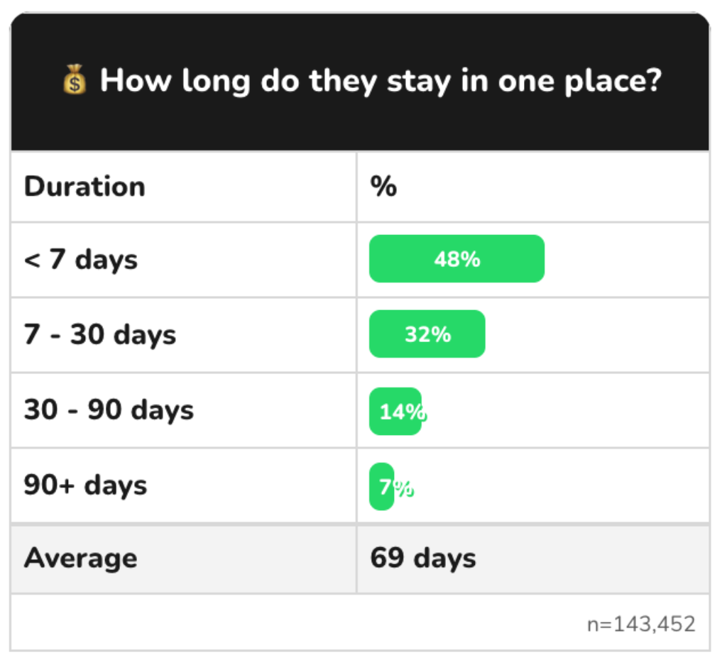
There are a number of categories including age, nationality, gender, sexuality, relationship status, income levels, diets, religious and political views, likes and dislikes, etc. We can learn also about the places that nomads like to visit, how long do they stay in one place, what they do for work, for fun… The data drills down pretty deep and is definitely fascinating!
What we find particularly interesting are the stats on Length of stay. As much as 48% of nomads say they stay in a location below 7 days, 32% stay between 7-30 days yet the average duration is 69 days!
The Not so Good
Data Sample
The founder of the Nomad List, Pieter Levels is not trying to be misleading, he is very clear from the beginning, about what to expect from the report and states himself that the info is merely indicative and includes a selection bias as Nomad List is a paid membership community.
“Data is merely indicative, includes selection bias” and covers at best only about 0.18% of an estimated 10.9 million digital nomads. This all makes it far from being representative.
What Pieter, is not so clear about is how big of a population sample we are actually looking at. The report mentioned that the data is from tens of thousands of Nomad List members but that is a bit of an overstatement.
Yes, Nomad List has, as of the date of this article, exactly 30,269 members, however, the data sample is mostly only about 20K of people. So, yes technically it’s right, but it’s a bit smaller sample than you would expect. Especially if we consider that, as cited by Forbes and based on the MBO Partners recent report, there were an estimated 10.9 million digital nomads across the globe in 2020. So we are talking about a data sample of 0.18% of the population. Interesting but far from representative.
Ok, let’s say that having a survey of 20K people is still good enough. Great! But wait, most of the metrics are based on an even smaller sample of users, with the lowest one with only 56 participants. Can you really conclude that most nomads earn between $50k – $100k / year if you base it on 134 members who paid for subscriptions? We doubt it. And yes, you should definitely pay attention to the “n=” that Nomad List thoughtfully includes under each chart.
On occasion a question like “Where would nomads like to go?” allows more than one response, which explains why that question has 147K responses. That however doesn’t mean that this many people actually voted, it only indicates that respondents can pick more than one answer per question, ultimately inflating the numbers. It’s unclear how exactly it was calculated.
Methodology
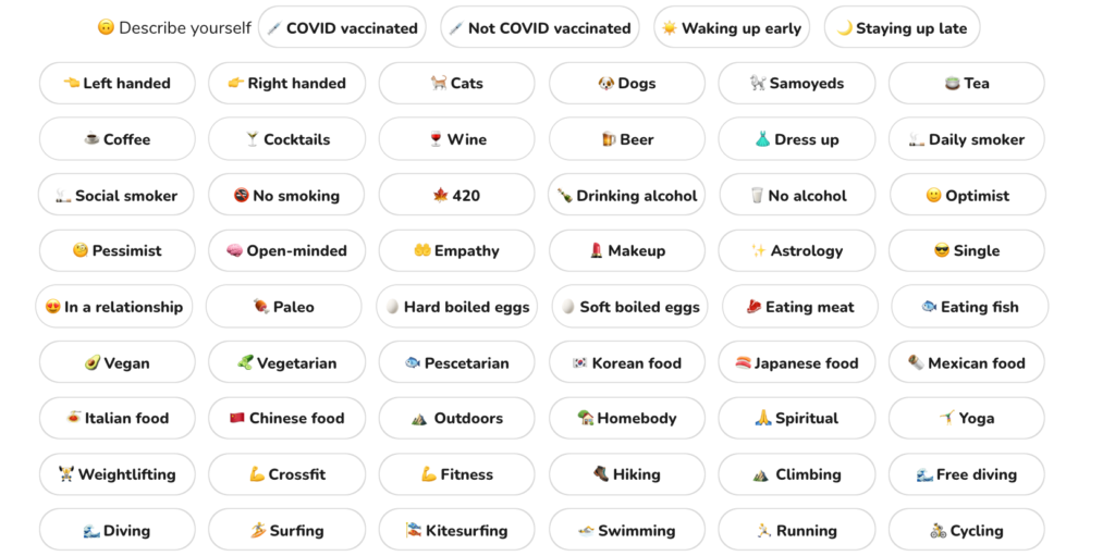
How the Nomad List works is that they ask you some basic questions about your: gender, sexual preferences, what you are looking for (Friends, Dating, etc), what you do for work, and what is your education. After that, there are 31 lines with 5 or 6 options per line where you are asked to “describe yourself”. That is a very long list. At all times you can pick as many or as few answers as you wish.
As much as it’s fun to pick the tags that describe you, you get pretty tired pretty soon. We would question how many people have actually got through the whole list and picked all the things that apply. If they haven’t chosen things that apply, how representative the data really is? Is sustainability really so unattractive? We have questions 😀
The most baffling metric
There are certainly some curious metrics that are used but the most baffling of all is the ranking of attractive/unattractive traits in people.
According to the report, the most attractive man is a Covid Vaccinated Gardener who is already In a relationship but is Open-minded and a Buddhist. While the most attractive woman is a Clean freak, who is In a relationship, and loves Astrology, Gaming, and Van life. Really? Wait! What‽ And this is not all!

Apparently, the most unattractive man is a Daily smoker who likes Break-dance, Blues music, Facebook, and Sustainability 😀 While the most unattractive woman is a Private Pilot, who smokes daily, is a Conservative or a Centrist that listens to House music.
And does that mean that people are interested in other people mostly when the other person is in a relationship? Well, hopefully not. Apparently, 67% of people on Nomad List are Looking for Friends or Travel buddies.
This just cannot be!
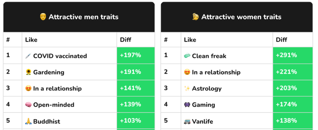
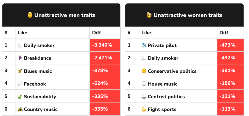
Ok, let’s break this down. We’ve reached out to Pieter on Twitter to ask him how is the above calculated. He explains that it analyses the info from the dating part of Nomad List (http://nomadlist.com/dating), where people like or dislike others based on their photos (you know, like on Tinder).
Traits aren’t shown on the dating photo card unless they match with the user who’s swiping which means that you swipe based on the looks of a person that already holds the same traits that you do.
As Pieter puts it: “It’s not about how many people choose a trait. It’s what % of people who are rated attractive choose that trait vs % of people who are rated not attractive choose that trait”.
The results are skewed towards the looks of a person rather than traits.
That means that contrary to what Nomad List would have us believe:
- There is no guarantee that % of people who are rated attractive are rated so based on their traits and not plainly by their looks. The traits could be just coincidental.
- People can only like others who already like the same things, so there is no way to find someone attractive who would have different ‘likes’ than you have.
It’s not the traits people like or dislike that are the essence of the pole but it’s that attractive people have certain traits that unattractive people don’t and vice versa.
State of Digital Nomads, we kindly disagree.
The report paints a picture of a digital nomad as a white heterosexual male who earns between $50 – $100K/year working as a Software Developer, is from the US, eats meat, hikes, and of course, loves coffee and Japan.
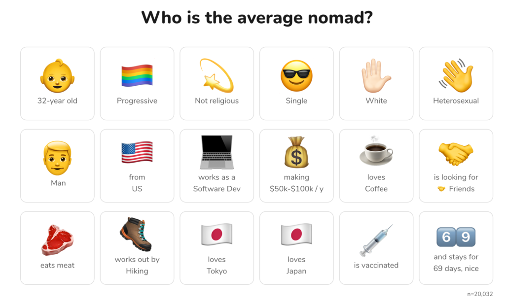
We disagree. The small data sample of the audience and the unclear, error-prone methodologies are not necessarily a correct representation of the bigger digital nomad population.
Also, on a more personal note. These are certainly not the only people that we have encountered on our nomad path.
Why are you picking on Nomad List?
The truth is, we are not. We just want to respectfully challenge the results and question some of the methodologies. This is a great starting point for an interesting discussion but we should all take it with a big pinch of salt.
Last updated September 26, 2022.
REVIEW
FAVOURITES
SHARE
NEWSLETTER
No Spam, Just Updates!
FOLLOW US
DIGITAL NOMAD VISAS


